



• Security notice: Ernie Ball staff will never send you a direct message about a prize or giveaway, and will never ask you to click a link to "claim" anything.
    If you receive a message like that - even from an account whose name looks official - do not click the link. Please report it using the Report link on the message so the moderators can act. A scam campaign impersonating admin accounts was blocked on 29 July 2026; those accounts are banned and their messages have been deleted.

New Theme Option

moderith

Administrator
Joined
Jun 13, 2007
Messages
106
Hi everyone,

We have been working over the last few months on getting a new theme up and running for the site. We are now ready to show everyone!

For the time being, we are going to be beta testing it with your help. To access the new theme you can click the link below.

http://forums.ernieball.com/forum.php?styleid=22

Once you click that you will see the new theme in all it's glory. If you prefer to switch back to the old theme you can do so in the footer of the page using the dropdown and select Ernie Ball.

Please let us know if you find any bugs, and we will try to address them.

Thanks Everyone!
 
Sweet! That really does look great. Now if only they could make it so that people had to have 5 posts before making threads, so they would find the serial number threads. Also really cuts down on spammers.
 
The moderators have been testing for a little while already. I really like it, and it's responsive, i.e. works well on different screens sizes. I can forum from my phone and it doesn't suck! :D

Well done to Moderith and the team!
 
i like the overall look, it just find the font in threads to be a bit too large. But zooming to 90% in my browser fixes that issue for me.
 
I’m not usually a great fan of change but definitely liking the new look. Many moons ago when I joined this forum I was solely using a laptop so this format was great but is a bit (in short) small and fiddly on an iPhone so new format from what I’ve seen looks pretty good too me.
(It only seems 5minz ago that this format was introduced)
 
The font size was a little larger earlier on. I won’t call it small on my laptop screen but I’m totally used to it now and I wouldn’t want it any smaller on my phone screen. Give it time.
 
I find the font size a little large as well. Though, I have to say I've become very accustomed to the theme. Love the overall look- it's pretty rad. And now the pink in my avatar matches better :)
 
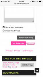
Bug: on iPhone SE if I open an attachment photo and try to zoom in it gets lost to the lower right of the screen.

54DFEC4C-E4D8-4F40-ACD3-E6C8A1ACF453.jpg

Can anyone else reproduce this? Is there a possible fix for this?

Some active buttons are still greyed out here and there.

1E944B24-DF62-4022-A16A-4DE6A5745CC7.png
 
Last edited:
I like it very much, except that it has too many different colors for my taste.. other than that it's an improvement. I also would adjust the page numbers for every thread in the overview to the new look by removing the border.
 
Why? Just to have something different? I guess so.

I think the current theme is very classy, I like it.

Hopefully there's a skin option to kill that loud lime green (looks like an Ibanez forum).

Sorry... I think you can do better!
 
looks good, but make sure it's readable by color-blind peoples!
might be some confusing colors
 
It looks more modern which is definitely nice but......everything is huge. On a 2560x1440 resolution monitor the stickies fill the page in the guitars forum.

It would be great if the header could be made smaller to accommodate the additional space everything else is taking up.
 
Back
Top